works
Stay Cool

►As climate change becomes an inevitability rather than a possbiility, heatwaves are becoming more common. Stay Cool would address immediate need and general lack of knowledge.
This project features a variety of ways to approach a problem ranging over multiple mediums.
Components
The campaign has 4 aspects to it: the Oasis, water bottles, posters, and animated tips
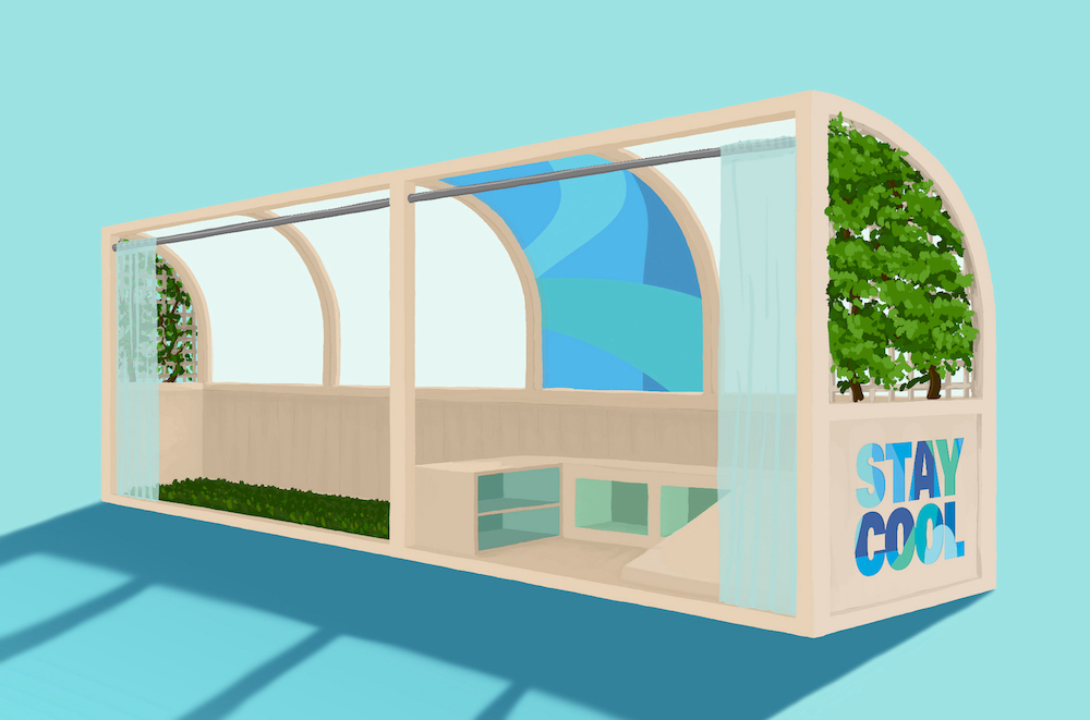
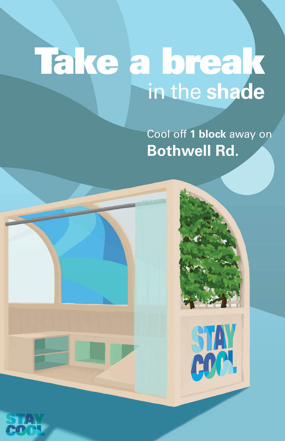
Oasis: These pop-up structures are designed to fit two street parking spaces. It is split into two sections. One half is a green area and the other is meant to be a recovery area for when one has a heat stroke.
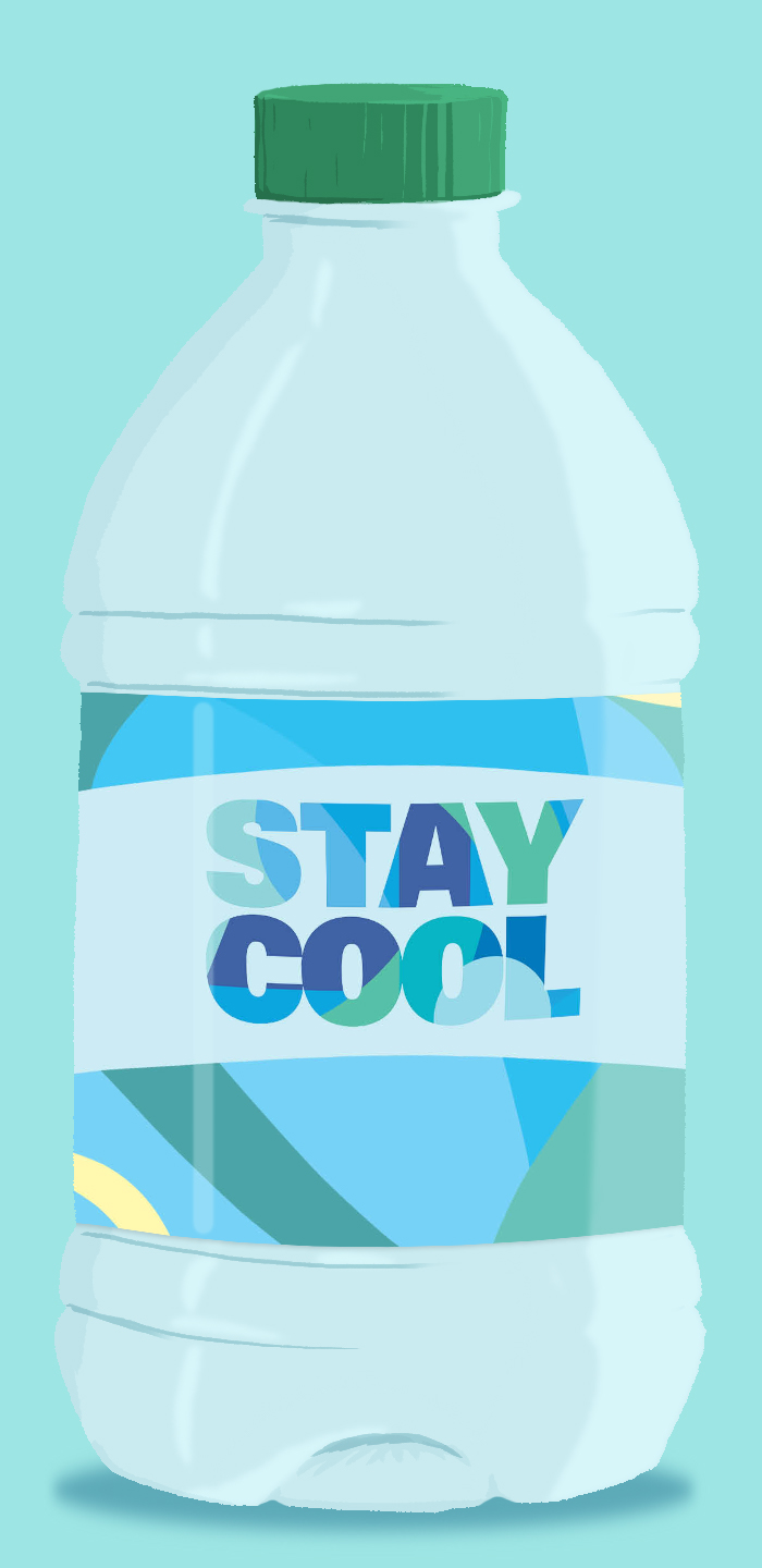
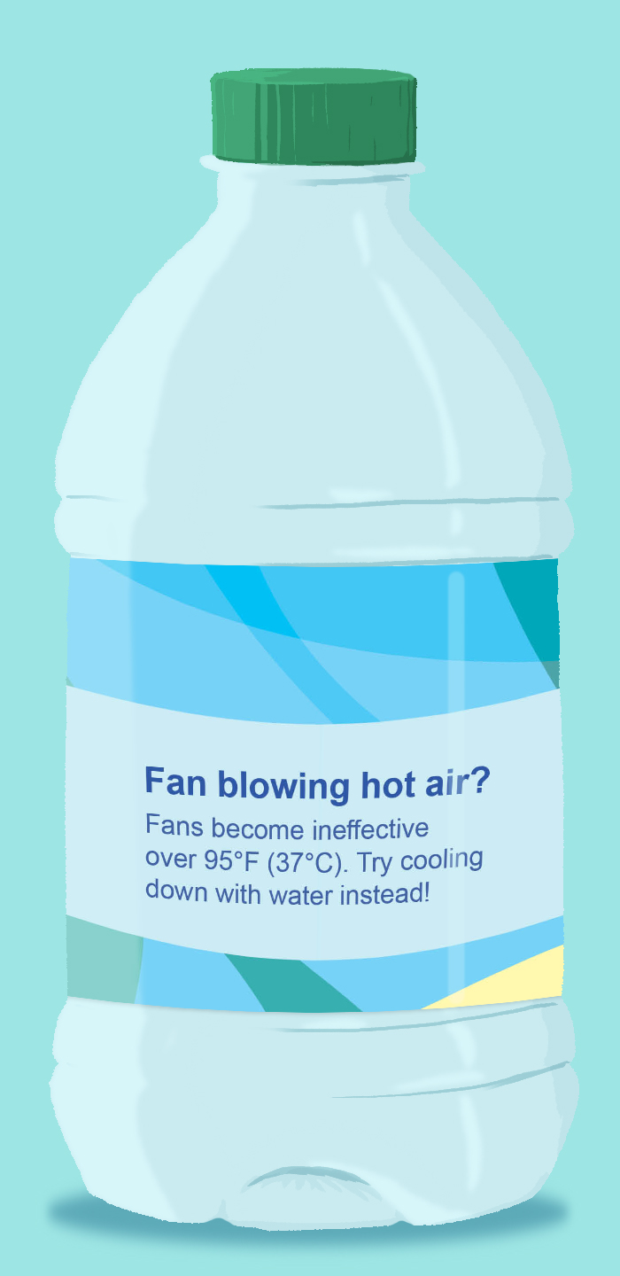
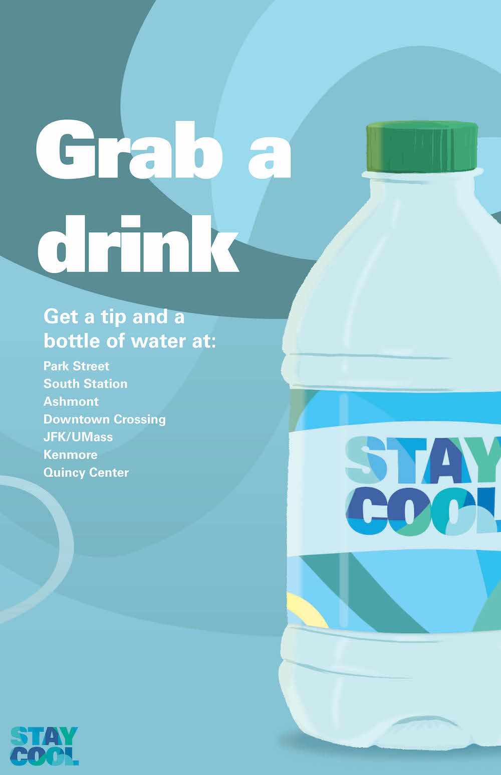
Water Bottles: These bottles will be handed out in high-commuting areas - primarily T and Commuter Rail stations. The location will give access to working people during a situation where it is typically hot and muggy.
Posters: These posters will be placed around bus stops, T stations, and neighborhoods where oasis pop-ups will be located. The oasis posters will have directions to the nearest oasis while the water station posters will have a static list of locations of the water stations.
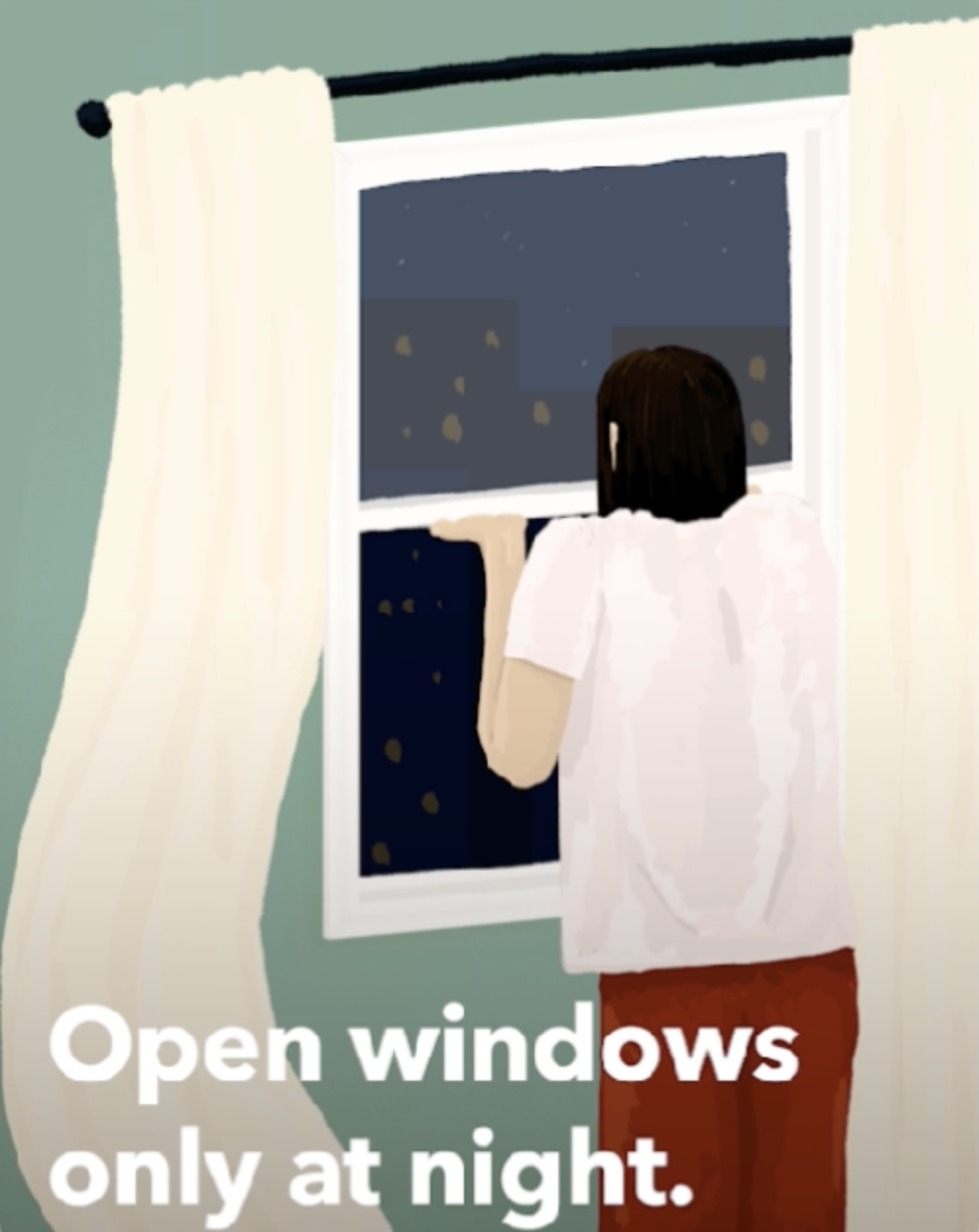
Tips: A series of videos that visualize tips to deal with heatwaves. They are designed for digital billboards, but can also be shown on social media.
Style and Feel
My philosophy for style was to have the campaign feel friendly and refreshing. On that note, I wanted to use rounded clean shapes which were inspired by waterlines when a camera is half-submerged. As for color palette, I went for various shades of blues, leaning toward green. While the blue is an obvious choice, I leant towards green in order to have more luminance as I find purple-blues to be too stiff and dark. Accenting this is an occasional light yellow, which breaks up the blues when needed.

